A look back at May's installations

It feels great to be back on site installing after a year of pandemic related delays. Our May schedule is also a sign of what’s to come in the year ahead. This past month we helped to install three works of public art spread across three states.

Our first installation brought us to Boston with artist and long time collaborator Donald Lipski. The details of this installation are still top secret but we look forward to sharing more with you in the coming months.

The second and third installations were with Colorado based artist Patrick Marold. Patrick is well known for his artistic practice which works to bind the physical environment with our perception. His minimal approach to materials and design speaks to a deep connection to the natural world and his two most recent public works build on this theme.

Patrick Marold’s Alluvial Mirror for the Julia Street entrance to the New Orleans Ernest N. Morial Convention Center. Photo courtesy of Patrick Marold.

For the Julia Street entrance to the New Orleans Ernest N. Morial Convention Center Patrick designed Alluvial Mirror, a sculpture that pays homage to the pedestrian park’s historic location on the river front where a sandy beach once naturally formed due to the river’s alluvium. Alluvial, derived from the Latin alluvius, refers to the soils deposited by surface water.

Patrick Marold’s Alluvial Mirror illuminated in the evening. Photo courtesy of Patrick Marold.

Alluvial Mirror’s form is influenced by a trumpet’s bell, referencing New Orleans vibrant music scene. This striking 18’ tall, mirror polished sculpture is illuminated in the evening.

Patrick Marold’s Cirri for the new Terminal 2 of the Fort Lauderdale-Hollywood International Airport

For the new Terminal 2 of the Fort Lauderdale-Hollywood International Airport artist Patrick Marold created Cirri, a suspended sculpture that fills the vertical space.

The installation of Patrick Marold’s Cirri.

Composed of over 5,000 feet of black steel strap and structural aluminum, Cirri presents an expansive and spatially integral composition of layered lines drawn into the volume of the architecture, augmenting the public’s perception of scale and dimension. The sweeping bodies maintain a lightness and a delicate response to gravity that enforces a dynamic presence, referencing cirrus clouds.

The installation of Patrick Marold’s Cirri as seen from above.

The three layers nest within each other and activate a moire effect that enhances the viewers movement and visual experience from below. The various perspectives available in the terminal allow for unique visual experiences, as does the changing light conditions through out the day.

Patrick Marold’s Cirri as seen from below.

Special thanks to Mathias Leppitsch, Nick Geurts, Silo Workshop and of course Patrick Marold. Stay tuned for more installation updates coming soon.

Interface Installation

This past month we completed the installation of Catherine Widgery’s artwork entitled Interface for the Innovation Center at Iowa State University. This site responsive art installation touches two areas of the building with two distinct designs.

Pictured: Renderings of the vestibule design and courtyard design that comprise Interface.


As one enters the building they first encounter the vestibules whose pleated dichroic glass walls break up and reconfigure our surroundings, so we see ourselves in relation to the world around us in a transformed way. Anyone passing through the vestibules is reflected multiple times in shifting fragments, a visually rich and always changing experience.

Pictured: Details of the vestibule design post installation.


The artwork located in the interior courtyard on the second level is a series of suspended ‘floating’ lacy copper screens. The thin copper panels have been cut in a chevron pattern which echos forms found in the buildings facade while referencing the pleated forms of the vestibule artwork. This canopy of suspended panels can be seen from windows above and below and within the courtyard itself.

Pictured: Detail of the copper panels.


Each panel is embedded with thousands of LED lights linked via computer software to an anemometer mounted to the building’s roof. The anemometer measures wind speed and direction so the lights dim and brighten sequentially in real time in response to the shifting winds.

Pictured: The suspended courtyard panels illuminated in the evening.


The art embodies the interface of technology at the threshold between the natural and the human built world, reflecting SIC’s wish for innovative technology to be part a of students’ exploration. What brings ‘life’ to the artwork is our capacity to monitor, record and translate information digitally. Technology translates into a visual experience the invisible energies that bring us alive to our environment through art. Interface also offers the possibility of bringing an interactive component into the lives of the students who will be able to ‘hack’ into the program and control the lighting in ways we can’t yet imagine.

For more fabrication and installation images of this project click here.

Select text from Catherine Widgery and select images courtesy of Elmendorf Geurts.

Coo Lot with Plum Pipes by Matthew Geller

Quite a few of our projects scheduled for 2020 installations were postponed so it made the ones we completed all the more cause for celebration including Matthew Geller’s latest work of public art Coo Lot with Plum Pipes.

Photo courtesy of Bob Perkoski

Photo courtesy of Bob Perkoski

Coo Lot with Plum Pipes transforms two empty residential lots by creating a new jaunty entrance to R.J. Taylor Park in Cleveland, OH which includes a spot for neighbors to saunter, meet, and gather.

Photo courtesy of Bob Perkoski

Photo courtesy of Bob Perkoski

Referencing the nearby Nottingham Water Treatment Plant, the artwork is a 135-foot labyrinthine of water pipes with a swaying bench, horizontal pipes that provide bench-like seating, and light that spills out of the vertical pipes like water to illuminate the path and trees in the evening.

Photo courtesy of Bob Perkoski

Photo courtesy of Bob Perkoski

With social distancing at the forefront of our minds Coo Lot with Plum Pipes provides ample space to sit and socialize safely and will no doubt become a welcomed addition to the neighborhood.

Photo courtesy of Bob Perkoski

Photo courtesy of Bob Perkoski

The Story of 'The Yearling'

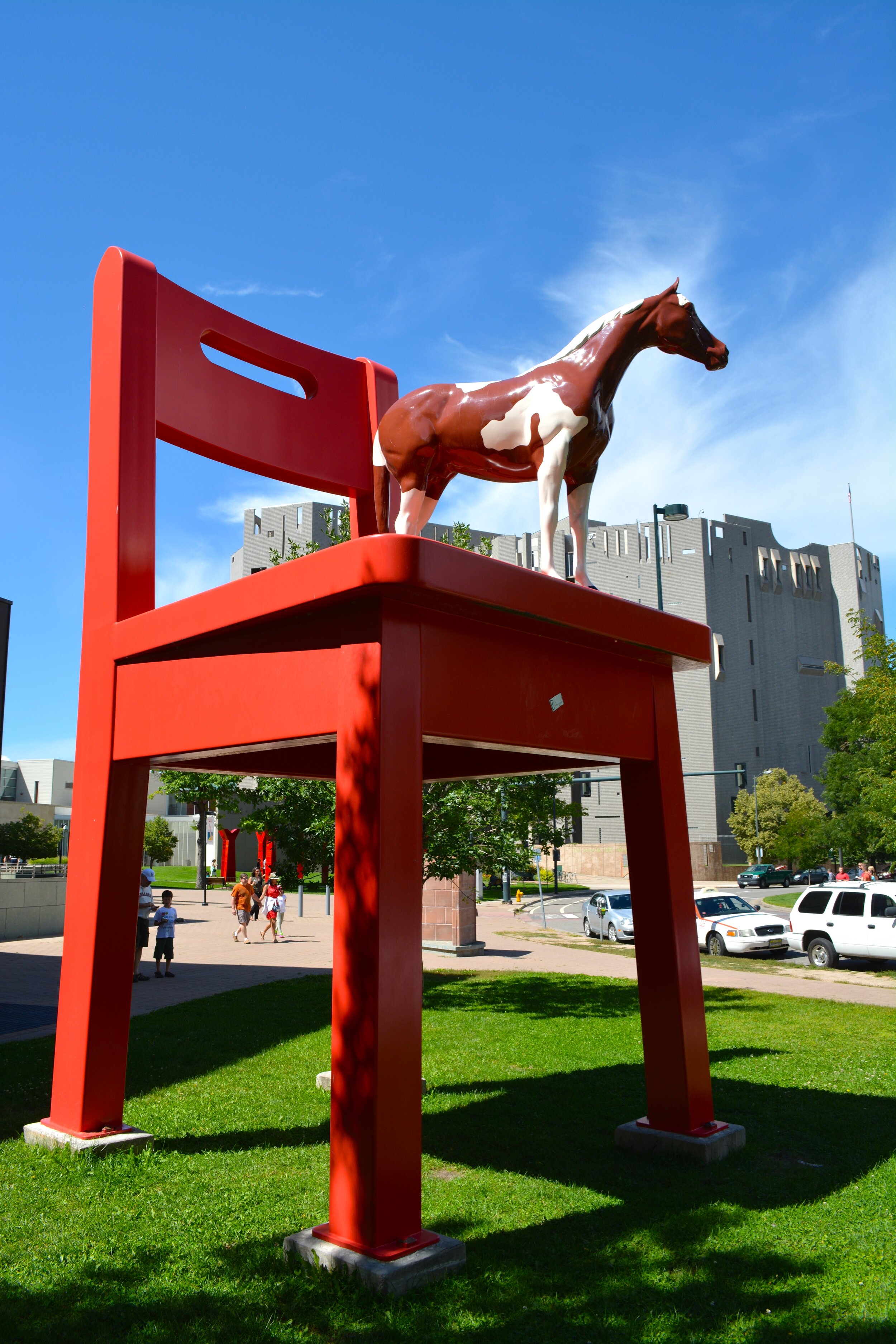
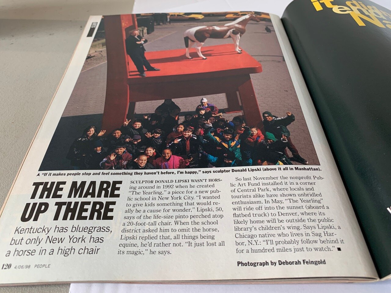
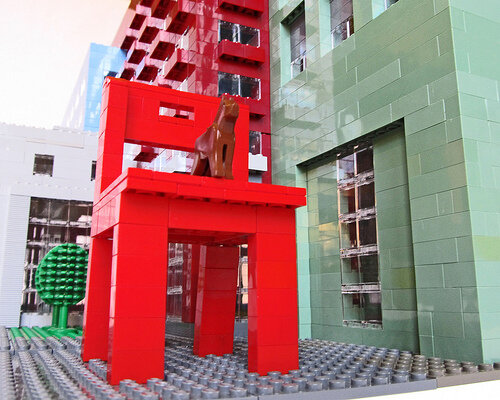
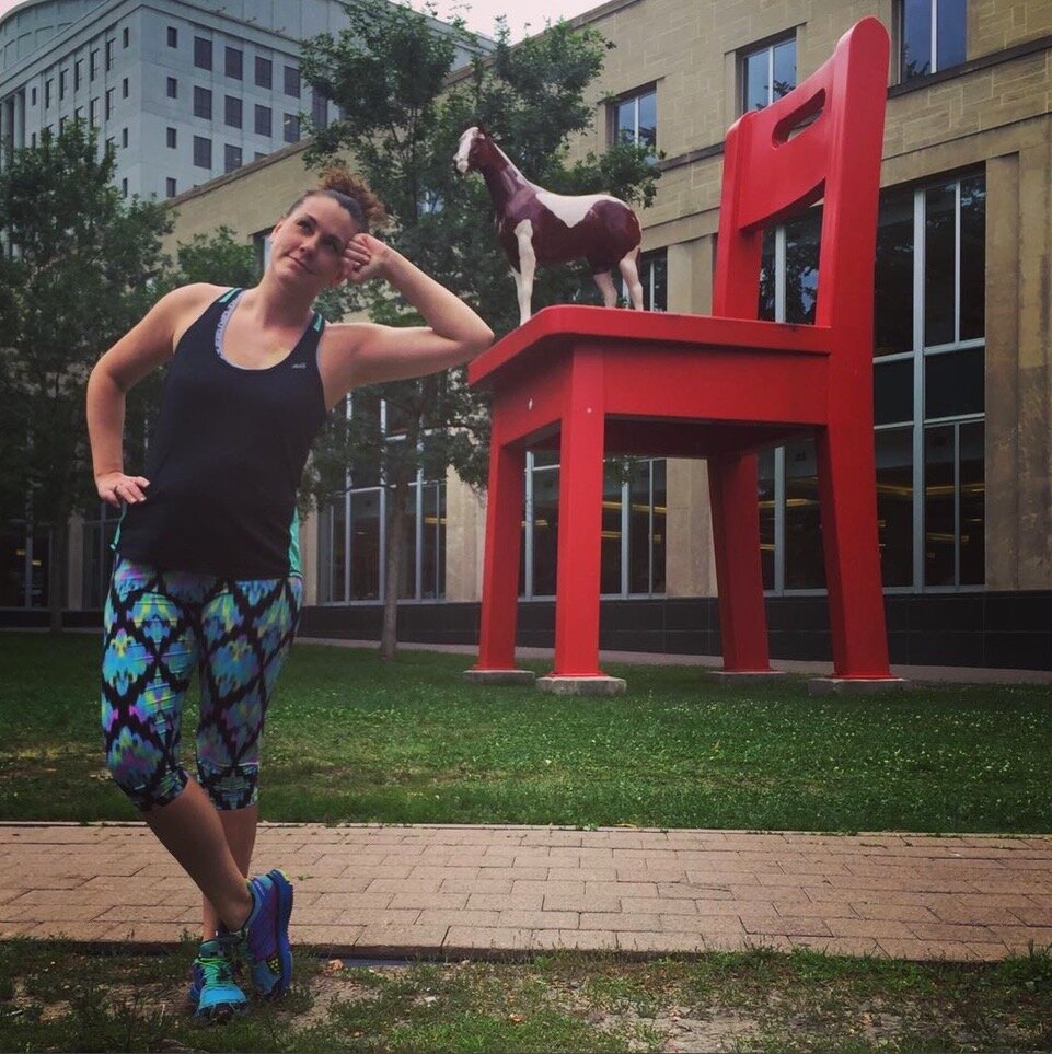
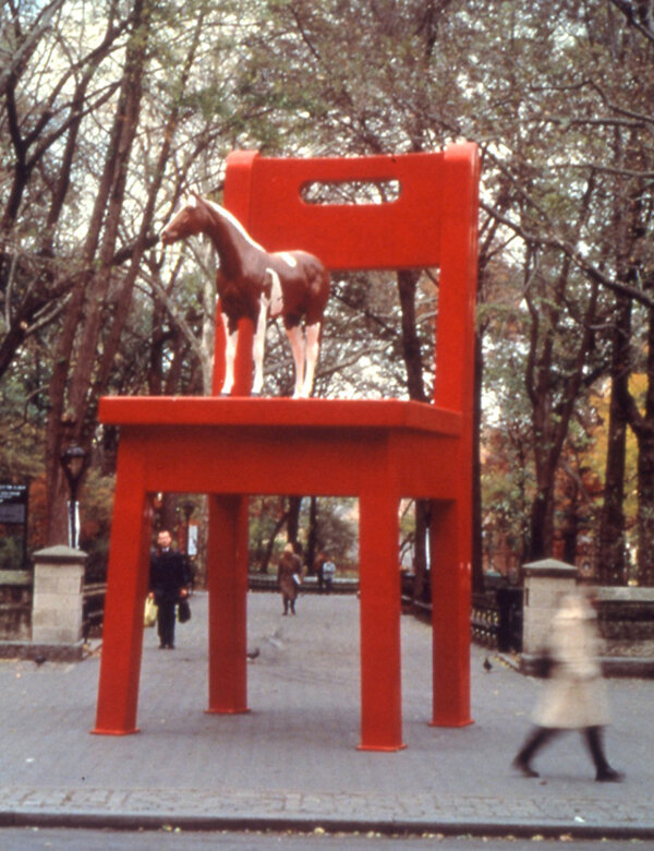
Donald Lipski’s The Yearling has become widely known in Denver and beyond since its creation in 1993 and its subsequent permanent installation at the Denver Public Library Central Branch in 1998. Today we’re going to examine it’s long journey from proposal to permanent home, over a five year timeframe. 

Donald Lipski, The Yearling, 1993

Donald Lipski, The Yearling, 1993

Around 1992 Tom Finkelpearl, who was the Director of New York’s School Construction Authority’s Art Program at the time, asked Lipski to develop a proposal for a new school in Washington Heights, located in the northern part of Manhattan. Lipski’s design for The Yearling was approved and he started the fabrication process. 

At the time the largely Dominican neighborhood had long-standing disputes with the Board of Education. Lipski explains the community’s reaction to the work, “Sometime afterwards there was sort of a dustup and the people in the community had some problems with the piece. Part of the backstory is that there was a yeshiva, a Jewish school, across the street that had opposed  the building of this school for a long time. During that process someone from the yeshiva had said ‘why spend good money to educate animals’. This obviously offensive statement stayed in people’s minds.”  

Donald Lipski’s son Jackson with an early model of The Yearling.

Donald Lipski’s son Jackson with an early model of The Yearling.

During this time Lipski also heard various other reasons why the community opposed the piece. For the Dominican community the horse could potentially be viewed as a symbol of repression because of the conquistadors use of horses during their colonization. Some raised concerns over the sculpture encouraging children to climb on furniture. In Lipski’s words, “My feeling was that  people really were taking out their anger at the Board of Education on me.” Lipski continues, “I wanted to do something that would cause the kids to imagine, to daydream. Kids are really interested in scale. They just want to be big. There's so much scale of exaggeration in children's literature. Alice in Wonderland, Gulliver’s Travels, James and the Giant Peach and so forth. At any rate the piece had been built and was in storage. There was a series of meetings. And I heard ideas like they wanted me to instead of a horse have a child wearing a mortarboard. Or a rainbow. None of these were satisfying to me. My thought was about the nobility of this horse looking out from a promontory. So I wasn't going to change the piece.”

The city continued to work to find an alternative location for the sculpture, offering it to different schools in the New York school system but they all rejected it because they wanted to remain in solidarity with this new school in Washington Heights. “So we were left with the situation where the piece had been built and paid for and was in storage, with no solution in sight,” said Lipski.  

Donald Lipski, La Guardia Suite, 1997

Donald Lipski, La Guardia Suite, 1997

Eventually an idea was developed to have Lipski create a new work for a different site and trade it for The Yearling. This resulted in the creation of  a new work for LaGuardia High School of Music and Art (located behind Lincoln Center and depicted in the movie Fame) entitled, The La Guardia Suite. This new work was installed in 1997 over the two entrances to the school’s theater and incorporated donated objects that represented the various performing arts taught at the school. “I was given violins from a violin program for children in Harlem called Opus 118, started by Roberta Guaspari, (played by Meryl Streep in the movie Music From the Heart). They had been damaged by a flood in their basement. I received ballet slippers from the New York City Ballet. I was invited to choose some costumes from the collection of The Theater Development Fund,” said Lipski. After Lipski created The La Guardia Suite, he reclaimed ownership of The Yearling

Donald Lipski, La Guardia Suite, 1997

Donald Lipski, La Guardia Suite, 1997

In 1997, The Yearling was exhibited at Doris Freedman Plaza in Central Park in New York by the Public Art Fund. As luck would have it, it caught the of eye of visitors from Denver and the The Yearling was later purchased by Nancy Tieken, who has since passed away, as a gift to the city of Denver. The piece was installed outside the Children's Wing of the Denver Public Library where it still sits today. 

Donald Lipski, The Yearling, 1997, Doris Freedman Plaza in Central Park in New York

Donald Lipski, The Yearling, 1997, Doris Freedman Plaza in Central Park in New York

So now we know how The Yearling made it to Denver, but that’s not where this story ends. The original horse that stood atop the giant red chair was made of fiberglass and due to Denver’s harsh UV rays the horse needed to be repainted every year. To alleviate this need for yearly maintenance, a mold was created of the original horse and it was recast in bronze. At the time the original fiberglass horse went on to reside in the office of Mayor John Hickenlooper who had grown fond of the horse. So fond in fact that when he was elected Governor, he took the horse with him to his new office. 

Donald Lipski, The Yearling, 1993

Donald Lipski, The Yearling, 1993

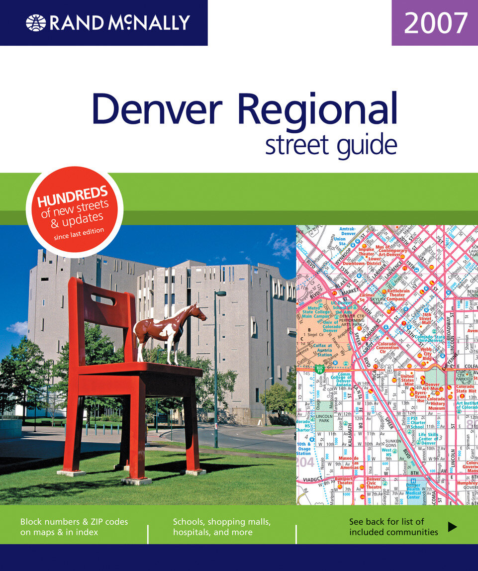
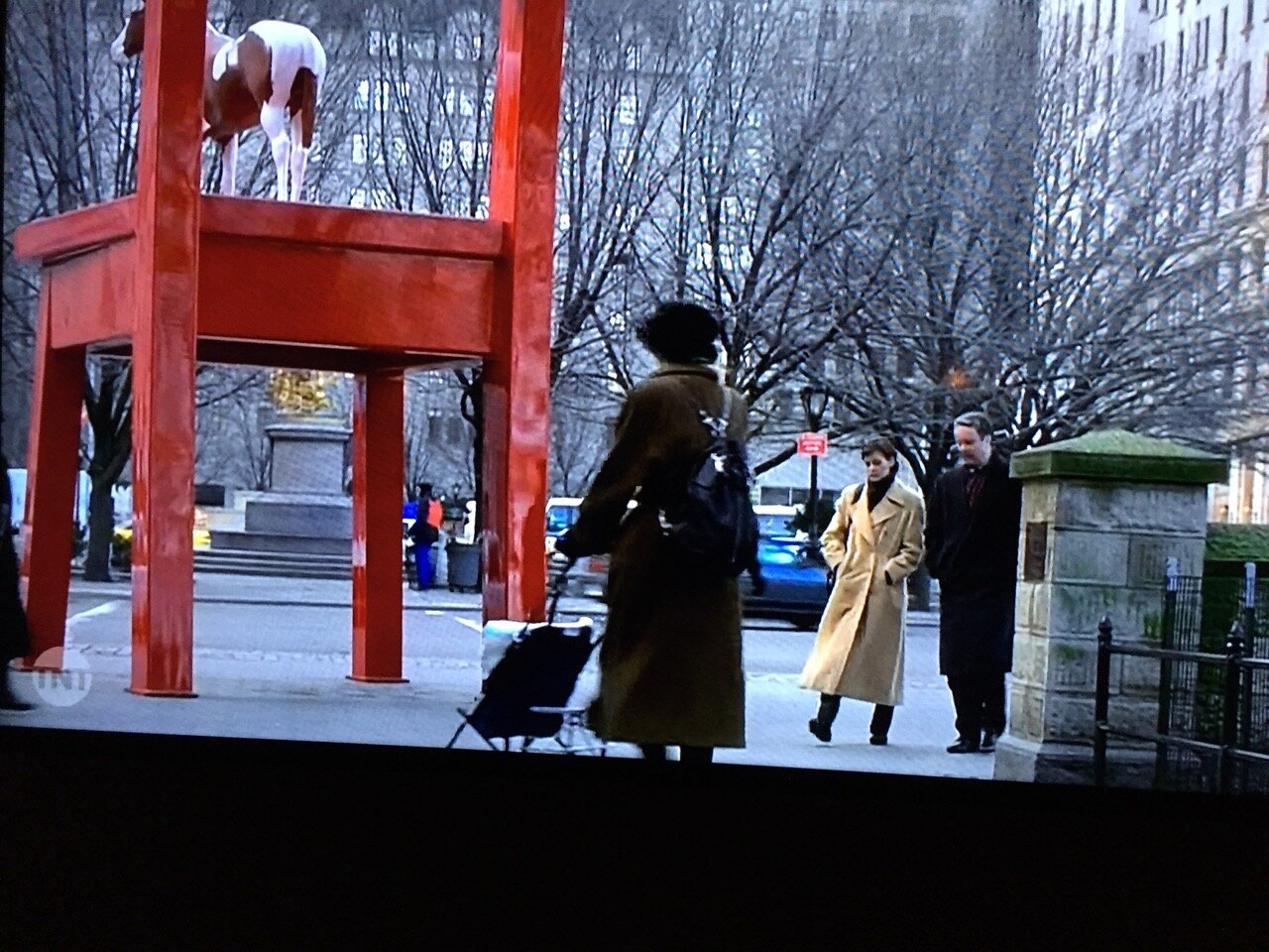
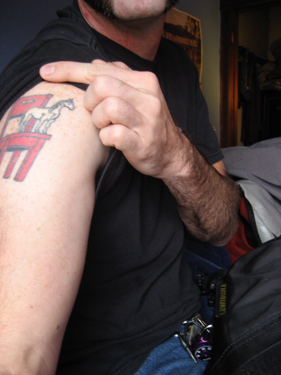
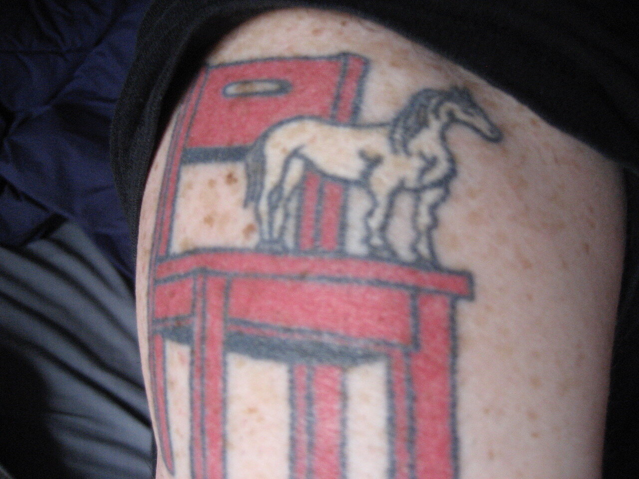
Despite its eventful origin story, The Yearling has only grown in popularity over the years. It’s been featured on the cover of the Rand McNally Road Atlas of Denver and the cover of Denver’s phone book. It even appeared on TV in an episode of Law & Order and was an answer on Jeopardy. Some individuals have even gone as far as tattooing this work of art on their bodies, using it to adorn their wedding cakes, the list goes on and on. This work also holds special significance to Public Art Services as it marks the meeting of Donald Lipski and Creative Project Manager, John Grant, who at the time was running Denver’s Public Art Program. We’ve now gone on to work with Lipski on over 25 projects with an additional 7 projects currently in the works. 

Larry Kirland's 'Pensacola Pendants'

Installation wrapped on Larry Kirkland’s design for the newly renovated Federal Courthouse in Pensacola, Florida just a couple of weeks ago. As visitors enter the courthouse they will be greeted by two identical 9’ - 6” x 4’ - 7” x 4’ - 7” hanging, sculptural, pendant lights that illuminate from within in the evening.

Exterior evening view photo courtesy of Nick Geurts.

Exterior evening view photo courtesy of Nick Geurts.

Through out the day as the sun shifts and catches the laminated, glass panels from different angles their stunning, organic blue patterns are showcased. The mirror polished, stainless steel framework reflect the blue, glass panels and the surrounding environment.

Photo courtesy of Nick Geurts.

Photo courtesy of Nick Geurts.

When viewed from below the nestled star formation is revealed. The form implies the United States of America’s official flag as well as the armed forces that are such a historical and important presence in the Pensacola region. 

Photo courtesy of Nick Geurts.

Photo courtesy of Nick Geurts.

For more information on this project and more installation and fabrication photos visit Pensacola Pendants. A big thank you to Nick Geurts for installation services and photographic documentation.

Double Dip Debut

The east bound traffic on E Iliff Ave in Aurora can now enjoy Elsa Sroka’s playful composition entitled Double Dip. We started work on this project in 2018 with the facilitation of the artist selection process for the site. Our client, Grand Peaks, wanted an exterior work of art that would enhance the look and feel of their newest development project, Spur at Iliff Station, and require little to no maintenance.

Elsa Sroka, Double Dip, ceramic tile mural

Elsa Sroka, Double Dip, ceramic tile mural

The location selected for the artwork installation is visible to passing traffic on E Iliff Ave, pedestrian traffic as well as residents of the new apartment complex, and light rail passengers arriving or departing from the neighboring Iliff Station. Material selection played a key role in the development of the project as we wanted to ensure the longevity of the artwork so rather than a traditional mural we went with a ceramic tile mural.

Unpacking of 387 - 12” x 12” ceramic tiles that make up the final 30’ x 12’ mural. Pictured left to right: Becky Wareing Steele, Project Coordinator, Elsa Sroka, Artist, and John Grant, Creative Project Manager.

Unpacking of 387 - 12” x 12” ceramic tiles that make up the final 30’ x 12’ mural. Pictured left to right: Becky Wareing Steele, Project Coordinator, Elsa Sroka, Artist, and John Grant, Creative Project Manager.

Our client fell in love with Elsa Sroka’s emotionally engaging work that adds a modern twist to the traditional western subject matter. Much of her recent work focuses on cows as the central figure placing them in unconventional settings; a conscious departure from the traditional context in which cows are depicted in much of western art. She finds the most important element to be the cow’s expression giving her subject a personality to inspire an emotional connection with both the painter and the viewer. Sroka believes the ordinary subject becomes significantly more intriguing when misplaced, inviting the viewer to pay attention through the element of surprise.

The original Double Dip painting by Elsa Sroka.

The original Double Dip painting by Elsa Sroka.

For this project Sroka painted a humorous, vertical composition of two cows, one perched atop the other, in a small wading pool. The original painting was photographed and enlarged into the final 30’ x 12’ ceramic tile mural. If you are in the Aurora area make sure you keep your eyes peeled for this precarious pair near the intersection of E Iliff Ave and S Blackhawk St.